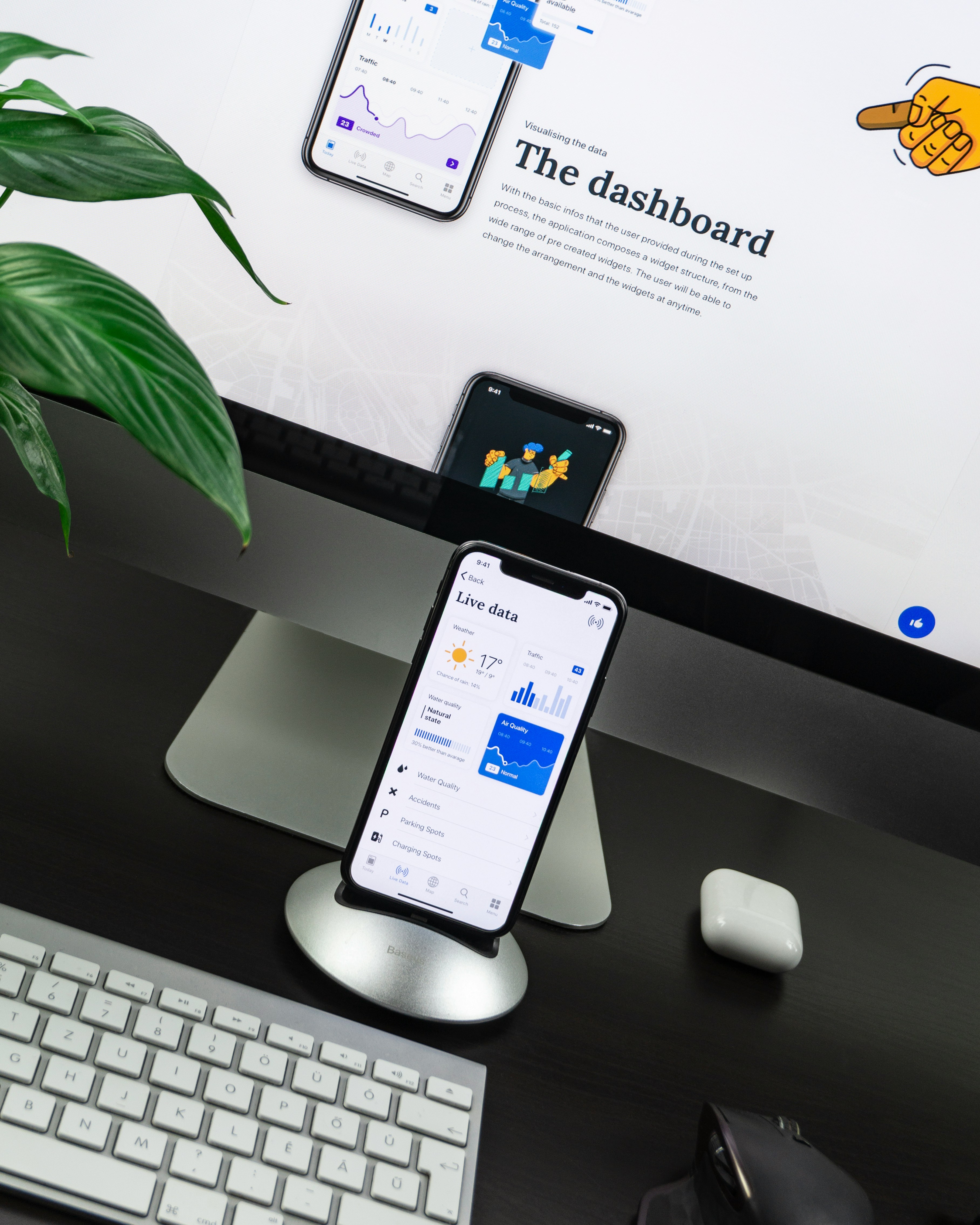
I was hired by DataDoes to help improve the design and user experience of their customizable dashboard app that let's companies in any industry connect with exisitng analytics platforms to help them see their important information at a glance.
UX research presentation
Sketch mockups
Invision Prototype
Stakeholder Discussion
I needed to understand the companies business objectives, key metrics and target market. So I create a survey that asked them to clarify and put into common terms exaclty what their vision and problesm are so that we could use it as a reference as a team as always be on the same page.
Their users are installing the app but not engaging
Engagement
They have a lot of free signups but users are not upgrading to the paid plan
Free to Paid Conversions
Their traffic is not very high
Traffic to Conversion Ratio
User Research Phase
We needed to get clear on the mental model of our target market and understand what they were having trouble accomplishing from both an informational side and a functional side. I also wanted to understand more deeply the customer joureny and transformation that they were looking to achieve in terms of a solution.

Quantitative research on existing metrics
Qualitative surveys and interviews
Inspiration and Mood Board
Blue tones and imagery that represent business, connection, point of sale and digital customer experience
Design Process
I first designed the task flows, followed by wireframes to give us a low-fidelity idea of the app screens and then into polish hi-fidelity static mocks


Final Deliverables
The final screens were delivered in vector Sketch files and handed of with design and tech specs to the developer for implementation

Testing and Feedback
Testing was conducted during the discovery phase to identify the biggest pain points in the current version. During the redesign: Testing was done at every milestone of the project. Invision prototypes were shared with stakeholders to get early feedback. After numerous surveys and user pilots, we launched the platform in June 2017 for our partner clients.
The Results
The redesign resulted in improved visual heirarchy and a refactoring of CSS increase google page ranking by 100%. Signup page conversion increase and a fully redesigned onboarding process and better UX to alow the user to connect and input complex 3rd party integrations with ease.


