Discovery Phase
We had discovered that there were not many low touch offerings for documentation sites that did not require a large amount of time to setup and create. We wanted to piggy-back off of Ghost because of it's agility and free open-source setup. So we setup to define the skeleton of a good, simple documentation knowledgebase site.

Documentation sites take too long to setup.
What is the time investment?
Simple doc sites cost too much
How can we reduce the cost?
We want to steer clear of the bloated CMS (ie WordPress, Squarespace)
How to reach niche market not using those CMSs?
Need to leverage a popular, yet underutitlized platform
Market to Ghost community
Working within limited design options
How to reach them
UX Research Phase
We did some exploration on existing templates and best selling themes and alternative solutions.

Quantitative research findings
Qualitative survey and interview findings
Results and Insights: We found that there is very little in the way of one-click setup that has ONLY what's needed for documentation and nothing else
Inspiration and Mood Board
Blue tones and imagery that represent business, connection, point of sale and digital customer experience
UI Design
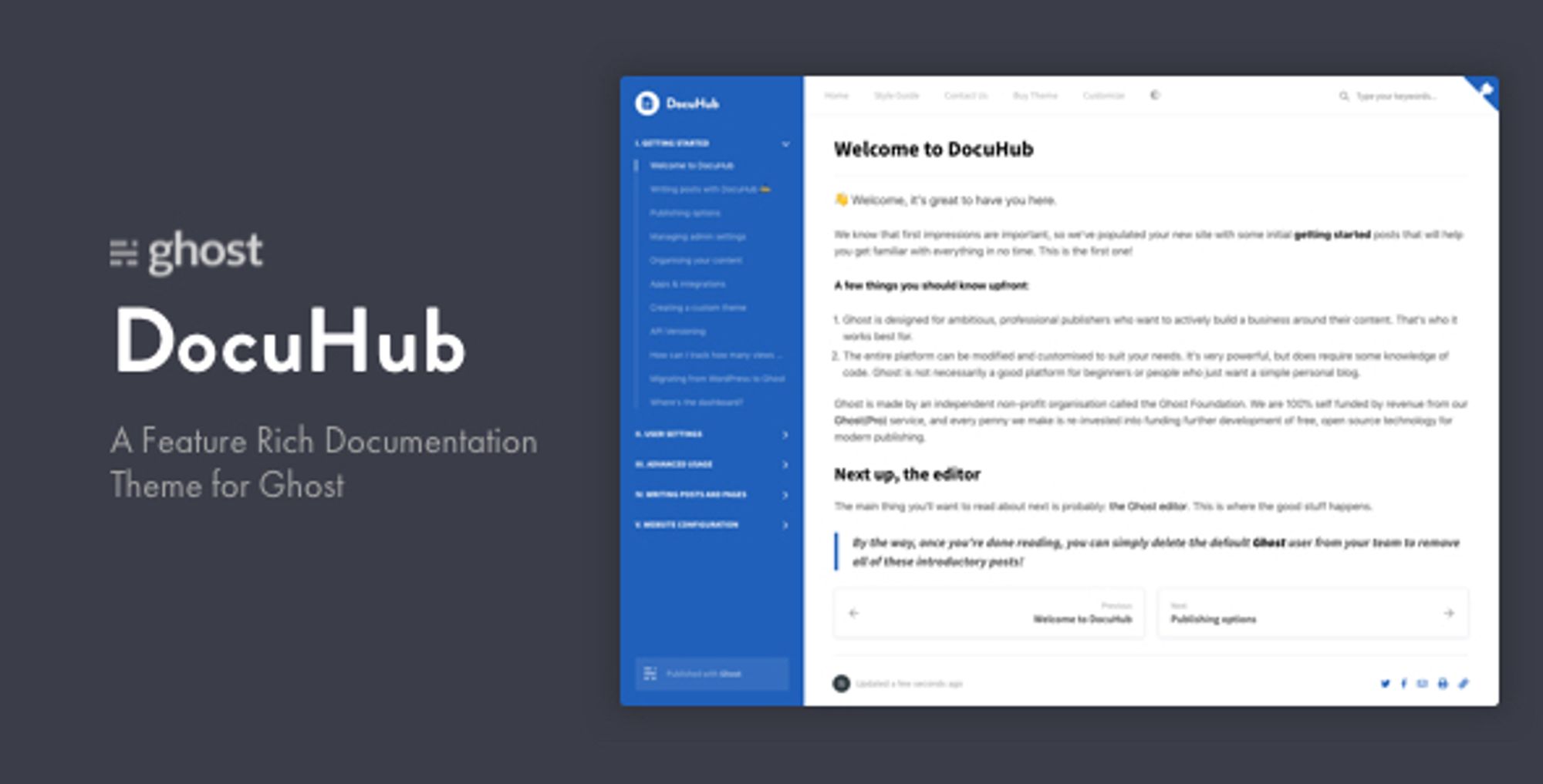
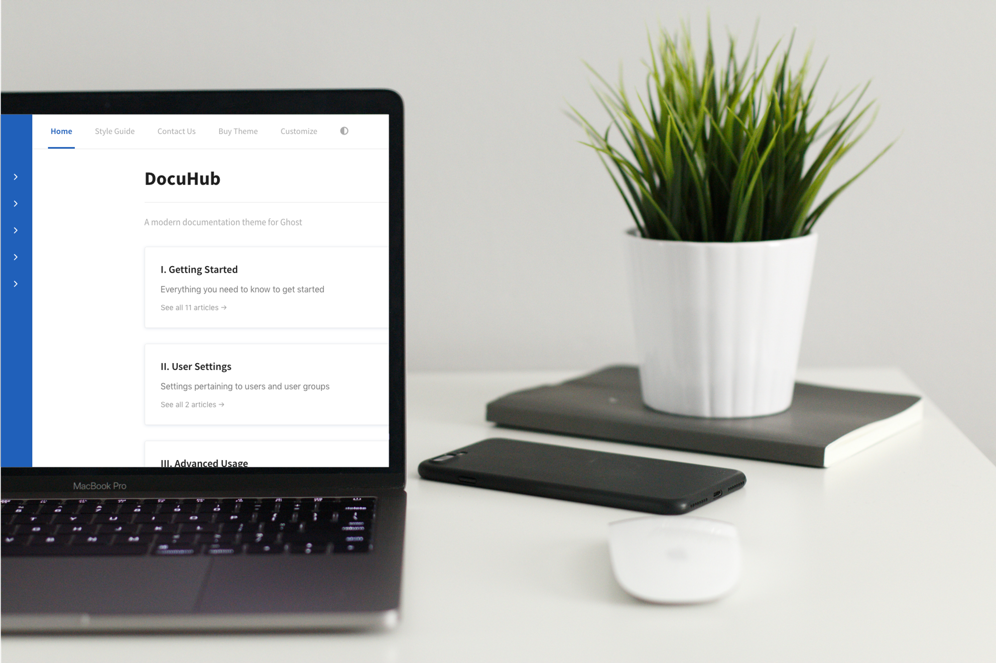
Using a classic, left sidebar navigation layout, we designed a compact, minimal site that allows you to load the theme into Ghost and immediately start populating it with your documentation and knowledge based content.
Live Prototype
I created an interactive prototype for each iteration, which we testing with our participants and customers to gain feedback and insight
Testing and Feedback
Testing was conducted during the discovery phase to identify the biggest pain points in the current version. During the redesign: Testing was done at every milestone of the project. Invision prototypes were shared with stakeholders to get early feedback. After numerous surveys and user pilots, we launched the platform in June 2017 for our partner clients.
